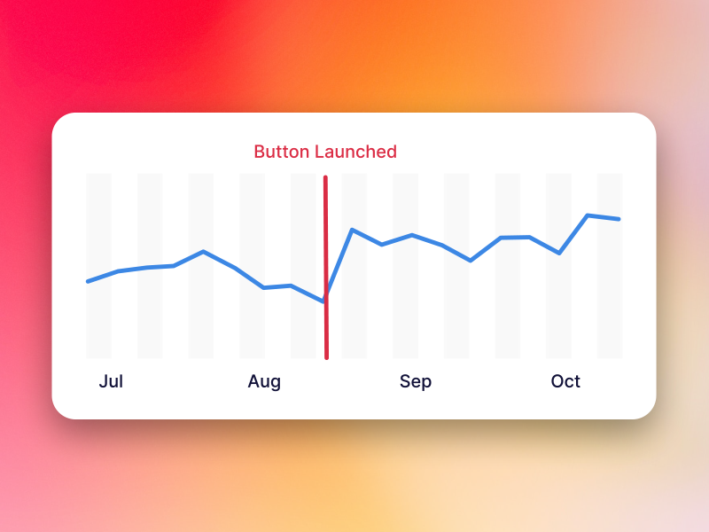
This article discusses how adding a simple call-to-action animation increased MRR (monthly recurring revenue) by 20%.
Is your product struggling to gain the attention and sales it deserves?
We've been there at Q2 2022. We have been running general, well-constructed ads with $2 CPC results. For a product that costs $16 /month, the conversion rates for Lordicon were a meager 0.5%. Things were looking pretty grim.
Lordicon launched in 2018, since then we have managed to produce 15000+ animated icons. For those unfamiliar with this niche, the average time to produce one animated icon takes one hour of work, so it's safe to say we've logged some serious hours on this. But it was a labor of love.
From the beginning, the main product assumption was to build an animated icon library that focused on a great user experience. For us, this meant an excellent product, being freemium, and of course - no ads.
The marketing plan was straightforward. Each and every icon was to have its own landing page with a short, unique description that contained some of the major keywords (AKA: Long tail SEO). Additionally, we were featured on ProductHunt, Appsumo page, and a couple of TikTok (not-paid) viral videos, which significantly boosted Lordicon's growth.
At the beginning of 2023, we found ourselves in the bad situation. We were doing all we could with paid advertisements but without any major wins. We determined that paid ads are probably reserved for these well invested projects that do not count every penny as we do.
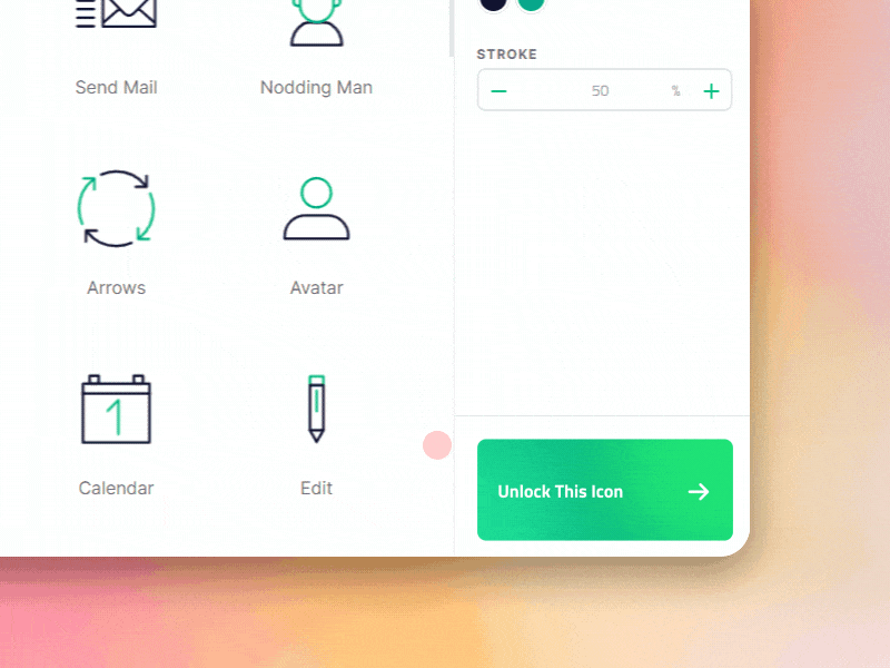
We needed to find a solution for bootstrapped projects like ours - a growth-hacking one. All of a sudden we realized one super simple thing: Our main library didn't have any major call to action compelling users to subscribe.
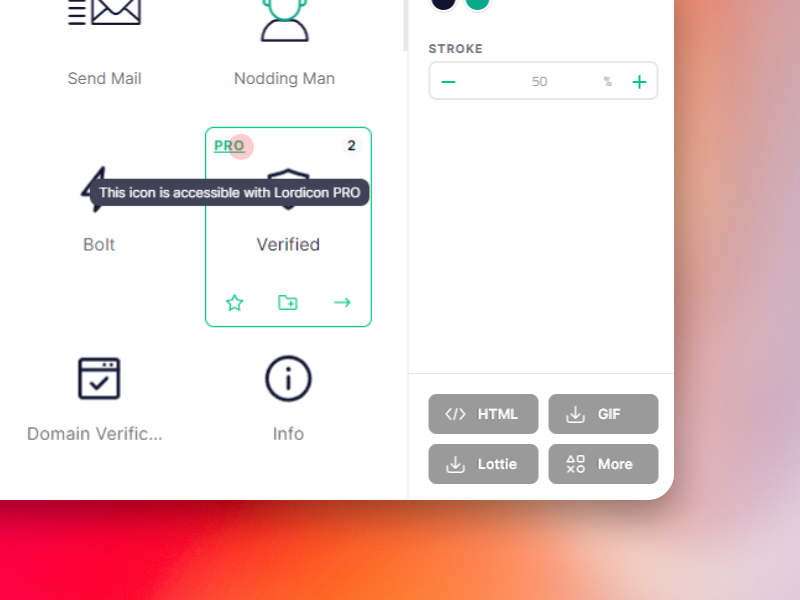
At the time of our lowest MMR growth, users were not being prompted to upgrade their accounts. If someone clicked on a premium icon, there was a small text "PRO," which on hover showed a tooltip saying, "This icon is accessible with Lordicon PRO."
The chance of someone seeing this and then voluntarily going over to the pricing page and getting a PRO plan was quite low.
And voila! You have got some more pennies to spend on ineffective ads. 🤤
Whenever you get stuck in a place that seems unsolvable, get back down to basics, stay humble, and know that there's a good chance you're just too close to your project to realize you're missing a basic but powerful detail. After all, if we could overlook sticking that big "BUY" button on my product's most commonly visited page, anyone can. Keep it simple, everyone!


Sorry to hear that. How can we improve this article?