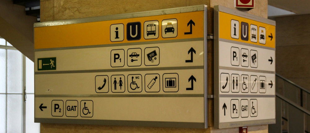
In the evolving landscape of digital design, communication is everything. It is the invisible thread that binds user, interface, and purpose into a coherent, seamless experience. Yet, while much focus is given to the visual aesthetics, usability heuristics, or the architecture of content, the deeper question often remains: how do we truly communicate meaningfully through design? In this context, animated icons emerge as powerful tools, not merely decorative but profoundly communicative. They don’t just enhance an interface; they speak.
When you include animation in your projects, you’re adding the element of time. This allows you to communicate on a whole different level than when you use static icons. Other design principles can’t always convey things such as color, shape, and type. Movement always draws our attention, and we’re always curious as to why something moves. Using our shared experience of real-world physics adds legitimacy to your animation, and is something that you should absolutely leverage.
Designing microinteractions and animated elements based on the logic of the physical world allows users to feel grounded in digital environments. Apple’s Human Interface Group (HIG) observed that animated icons help bridge the comprehension gap in UI. They are more than instruction; they become demonstrations. When an interface isn’t immediately understood, questions naturally arise, and animation responds intuitively to those questions:


Sorry to hear that. How can we improve this article?