Some things are more difficult to do than others. This mental effort we expend in trying to understand and complete a task is called the cognitive load. Think of it like a computer, and the processing power it needs to perform tasks. Viewing a webpage won’t take as much effort as, say, working with 3D design software, but there’s still a load all the same. In design, we want to avoid there being too much cognitive load on the user. The easier it is for them to understand your message, the better the chance of it landing.

Source: Photo by Steve Johnson
Why animation makes interfaces easier to understand
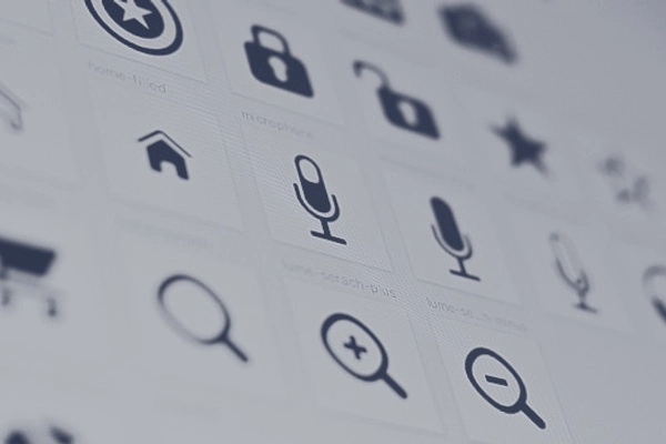
Animated icons reduce cognitive load by pairing motion with meaning. They simplify information, guide focus, and help users understand tasks with less effort. Grounded in cognitive psychology and dual-coding theory, thoughtful animation supports clarity, memory, and usability, making digital experiences more intuitive, efficient, and emotionally resonant without overwhelming the user.
TL;DR
-

Cognitive load is the mental effort required to understand or complete a task. In UX, our goal is to reduce this load to improve clarity and usability.
-
Animated icons help by making visuals easier to understand than text alone.
-
This effectiveness is backed by dual-coding theory (verbal + visual = better memory) and the picture superiority effect.
-
Von Restorff effect shows that unique or moving visuals (like animated icons) stand out and are more likely to be noticed.
-
Not all animation helps - it must be meaningful, purposeful, and goal-oriented. Poor animation increases confusion.
-
Microinteractions (like loading spinners or animated checkmarks) reduce friction, guide users, and improve feedback.
-
Anthropomorphic animation (movement that feels alive) engages human instinct, making icons feel intuitive and emotionally resonant.
-
Animation is vital for onboarding, mobile UI, and shared workspaces, where it replaces text-heavy explanations with visual guidance.
-
According to cognitive load theory, animation reduces extraneous load and supports the creation of mental models.
-
It also improves error prevention and recovery, helps build trust, and naturally directs user attention.
-
Ultimately, good animation reduces effort, improves understanding, and enhances the overall user experience - when done right.
What is cognitive load and why it matters

Cognitive load
Cognitive load is the mental effort needed to process and complete tasks. When it’s too high, users struggle to focus and make decisions.

Mental effort
Lowering it improves user understanding and interface success. Simple, clear layouts help users act faster and with more confidence.

The purpose of animation
Animation can intuitively ease that load. It directs attention, explains context, and reduces mental strain without extra text.
Animation as a load-reducing tool
This is where animation comes in. Sometimes, you can add an animated icon and it just feels like a much better option than a static equivalent, but you’re not sure why. This is because the cognitive load needed to understand the visual is much lower, and therefore ideal for the user. There's plenty of research to back up the idea that animation reduces cognitive load.
A pair of studies from Erasmus University Rotterdam concluded that you can reduce cognitive load through well-designed animations. Certain cueing techniques in complex animation could also ease the cognitive load for more efficient learning. This was supported by a study from the University of New Mexico, which found that a group of students using animated study aids outperformed counterparts without. Naturally, less cognitive load meant more efficient learning.
So, when you’re designing an animated interface and your gut feeling tells you it’s a better option, the research largely backs that up. Of course, not everything you design will automatically be improved by adding animation. Trust that instinct, and you’ll often help the user understand your intention all the more.
-
Animation reduces the mental effort needed to process visuals.
-
Research confirms animations enhance comprehension and learning.
-
Well-designed animation can validate designer intuition.
Tutorials, manuals, and the modern attention span
Reducing cognitive load in developing manual tutorials has never been more relevant than with the Internet of Things, and then by evolution, web content. We often skip tutorials when consuming new products, instead preferring to find our own way. Research from Penrose and Seiford shows that less than 30% of people in a study bothered to consult manuals before using a product. We’re less concerned with written instructions these days, and that’s something we have to consider in our designs. We need to find another way to attract attention, and animation helps with that.
-

Most users skip manuals and prefer discovery through use.
-

Traditional tutorials often fail to engage.
-

Animation provides a compelling alternative to convey instructions.
Dual-coding theory and visual cognition
Animation is particularly effective because it utilizes dual-coding theory, which posits that people understand information better when it’s presented both verbally and visually. An animated icon can quickly illustrate an action or concept, engaging both the visual and cognitive systems simultaneously, reducing the load on working memory. According to research, our brains process visual information differently from text, so well-crafted animations can communicate ideas faster and more intuitively than words alone. When information is encoded through two distinct channels, visual and verbal, recall improves, recognition strengthens, and cognitive effort decreases.
-
Dual-coding theory supports visual + verbal information delivery.
-
Animated icons activate multiple cognitive pathways.
-
This dual-channel approach improves retention and speeds up understanding.
Picture superiority and salient motion
Moreover, animated icons tap into the picture superiority effect, which suggests that images are more likely to be remembered than words. When users interact with digital products, they often face an overload of textual instructions, settings, or menus. Static visuals can help, but animated ones take it a step further, capturing the user’s focus through movement, differentiating essential elements from background noise. In psychological terms, this draws on the Von Restorff Effect: distinctive items, especially animated or moving ones, are more likely to be noticed and remembered than static, ordinary elements.
-
Users remember images more than words (picture superiority).
-
Motion enhances salience and captures attention (Von Restorff Effect).
-
Animated icons highlight what matters most in dense interfaces.
When animation hurts more than helps
It's important to note that not all animation is beneficial. Poorly executed animations, those that are too flashy, too fast, too complex, can actually increase cognitive load rather than reduce it. According to Designing Interface Animation by Val Head, animations must be:
-
Meaningful: clearly supporting the function they represent.
-
Purposeful: not distracting, but guiding the user's attention.
-
Goal-oriented: aligned with what the user is trying to achieve.
Microinteractions: small, functional animations like loading spinners, success checkmarks, or animated button presses - exemplify these principles. They offer instant feedback, guide expectations, and ease uncertainty, thus significantly reducing cognitive friction.
-
Not all animation improves UX - some increase friction.
-
Use the meaningful-purposeful-goal-oriented triad.
-
Microinteractions are the gold standard of functional animation.
Animated icons and human perception
An interesting insight from studies on animated anthropomorphism shows that even simple geometric shapes, when animated properly, are interpreted by humans as purposeful, emotional agents. Our brains are wired to attribute meaning and agency to movement. This can be leveraged in UX by making icons feel more alive and intuitive. A simple bouncing envelope suggesting new mail, or a spinning cog indicating settings, communicates much more rapidly than a static icon because it resonates with our natural tendencies for pattern recognition and emotional attribution. By tapping into this innate human trait, animated icons help users immediately grasp functionality without excessive cognitive effort.
-
Humans naturally interpret motion as intent.
-
Animated icons create emotional and intuitive connections.
-
Movement communicates function more efficiently than static symbols.
Practical applications and theoretical models
In practical terms, this has profound implications for modern interfaces. Think of onboarding flows, where users are quickly introduced to a new app's functions. Static screens loaded with text can overwhelm users and lead to abandonment. On the other hand, carefully crafted animated sequences, such as an animated checkmark confirming a completed step, can guide users through the process with minimal explanation. They replace reading with seeing and doing, which significantly reduces the initial learning curve. The same applies to navigation aids. Animated pointers, arrows, or expanding menus can intuitively indicate where to go next, subtly guiding the user without adding extra mental overhead.
Reducing cognitive load is especially crucial in mobile and wearable interfaces, where screen real estate is limited. Here, every pixel counts, and animations must do double duty:
-
Entertain: capturing attention without overwhelming.
-
Inform: delivering cues that help users make decisions.
-
Instruct: demonstrating processes or transitions visually.
In these contexts, animated icons become indispensable. They act as micro-instructors embedded within the interface itself. Without the need for separate manuals, users learn by observing behavior. This embodies the principles outlined in the WCAG accessibility guidelines, which emphasize the importance of clear, perceivable, and operable designs, and caution against animations that distract or overwhelm. Good animation reduces confusion, while bad animation introduces barriers.
Cognitive load theory also distinguishes between intrinsic, extraneous, and germane cognitive load. Intrinsic load relates to the inherent complexity of the task. Extraneous load stems from the way information is presented. Germane load involves the effort devoted to building mental models. Good animated design reduces extraneous load by clarifying information presentation. Instead of bombarding the user with details, it visually organizes and prioritizes content. In doing so, it frees up mental resources to focus on the task itself, improving overall usability and learning outcomes.
The key lies in designing animations that support cognitive goals rather than aesthetic whims. Animations should:
-
Signal change: making system status updates obvious.
-
Confirm actions: reassuring users that their input was received.
-
Visualize consequences: showing what happens next to build trust.
When users can predict system behavior through animation, for instance, a button that slightly shrinks when pressed or a loading bar that fills gradually, they build mental models more easily. This predictive capacity reduces cognitive uncertainty, leading to smoother, more satisfying experiences.
A growing body of research also points out that animations facilitate error prevention and correction. When users are guided visually, they are less likely to make mistakes. And when mistakes do occur, animated feedback can direct them towards solutions without the need for verbose error messages. This fits into Don Norman’s concept of error recovery, emphasizing design that helps users diagnose and recover from errors gracefully. Animated cues like shaking fields for incorrect inputs or smooth transitions back to correctable steps exemplify this principle.
In the context of collaborative tools like Miro, animations play a critical role in shared workspaces where multiple users interact simultaneously. Here, animated indicators, like cursors that move fluidly or comment bubbles that gently appear, prevent cognitive overload by visually distinguishing who is doing what and where. Without these cues, shared environments could become chaotic and disorienting.
Finally, the success of animation in reducing cognitive load can be explained by theories of attention. Movement attracts attention automatically. Studies show that dynamic elements in an otherwise static environment capture and direct the gaze more effectively than static elements. In UX, this means that well-placed animations can prioritize what users should look at first, ensuring that critical information is not overlooked. It’s a subtle orchestration of visual hierarchy, one that feels natural rather than forced, and leads users to intended outcomes without them even realizing they are being guided.
-
Animation helps in onboarding, navigation, and instruction.
-
It supports attention management and error recovery.
-
Visual hierarchy through motion guides users subconsciously.
In conclusion, reducing cognitive load through animated icons is not just an aesthetic choice; it’s a cognitive necessity for good UX. Well-designed animations tap into our brain’s natural preferences for visual stimuli, dual coding, and motion-based attention. They make interfaces more intuitive, memorable, and forgiving, enabling users to achieve goals with minimal mental effort. However, success depends on thoughtful, user-centered animation design that enhances rather than complicates the experience. Trust your instincts, rely on the science, and remember: when animation feels right, it often is, because it’s working with, not against, the mind's natural flow.
Checklist
-
Use animated icons only when they simplify understanding - never add motion just for decoration or novelty.
-
Keep animations smooth, short, and easy to follow - overly complex or fast animations increase cognitive load.
-
Pair animated visuals with clear text or labels to reinforce meaning through dual-channel communication.
-
Highlight key elements with motion - the picture superiority effect makes animated icons more memorable than static ones.
-
Make sure every animation serves a UX function: it should signal status, confirm actions, or guide decisions.
-
Avoid flashy or distracting motion - animations should help, not hinder, the user’s ability to focus and process information.
-
Follow WCAG standards for accessibility - animations must be pausable, stoppable, and sensitive to motion triggers.
-
Use animation to reduce the need for written instructions - people rarely read manuals, so guide them visually through interaction instead.
Sources
Sources
- Scientific American: Animating anthropomorphism
- Val Head: Designing interface animation
- ACM Digital Library: Animation: can it facilitate?
- Wikipedia: Cognitive load
- Laws of UX: Von Restorff Effect
- Erasmus University Rotterdam: The effects of animation in learning
- Theseus.fi: Reducing cognitive load in UI design - Bachelor's thesis
- Nielsen Norman Group: Minimize cognitive load to maximize usability
- Wiley Online Library: The modality effect in multimedia learning
- Miro: Visual collaboration platform
- Wiley Online Library: Cognitive load theory and instructional design
- University of Twente: Cognitive load and learning environments - thesis
- MODE Summit: The role of visual transitions in UX
- CORE: Effects of animation on learning
- Nielsen Norman Group: Microinteractions in UX design
- Wikipedia: Dual-coding theory
- SpringerLink: Picture superiority effect in memory
- Wikipedia: Picture superiority effect
- W3C: Pause, stop, hide (Understanding WCAG 2.1)
- Wikipedia: Internet of things
- Don Norman, The design of everyday things
Tags
cognitive load
animated icons
ux design
dual-coding theory
picture superiority effect
microinteractions
instructional design
interface animation
motion in ux
attention guidance
error prevention
inclusive design
visual learning
human-centered animation
Was this article helpful?

Sorry to hear that. How can we improve this article?