Accessibility isn’t just about serving users with disabilities. It’s about improving the experience for everyone. When a digital product is designed with accessibility in mind, it becomes more intuitive, efficient, and enjoyable for all users. Here’s why accessibility-first design should be a priority:

Source: Photo by Robert Ruggiero
Importance of accessibility in UX Design
This article covers the core principles of accessible UX design, why it matters, how to implement it, and how visual elements like animated icons can improve clarity, engagement, and navigation for all users.
TL;DR
-

Accessibility is a core responsibility, not an optional feature.
-
Designing inclusively improves UX for everyone, not just people with disabilities.
-
Accessibility compliance also brings legal, ethical, and business benefits.
-
Four pillars define accessible UX: perceivability, operability, understandability, and robustness.
-
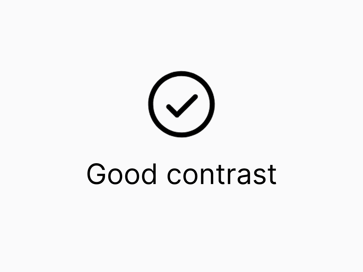
Perceivability demands alt text, strong color contrast, and clear visual cues.
-
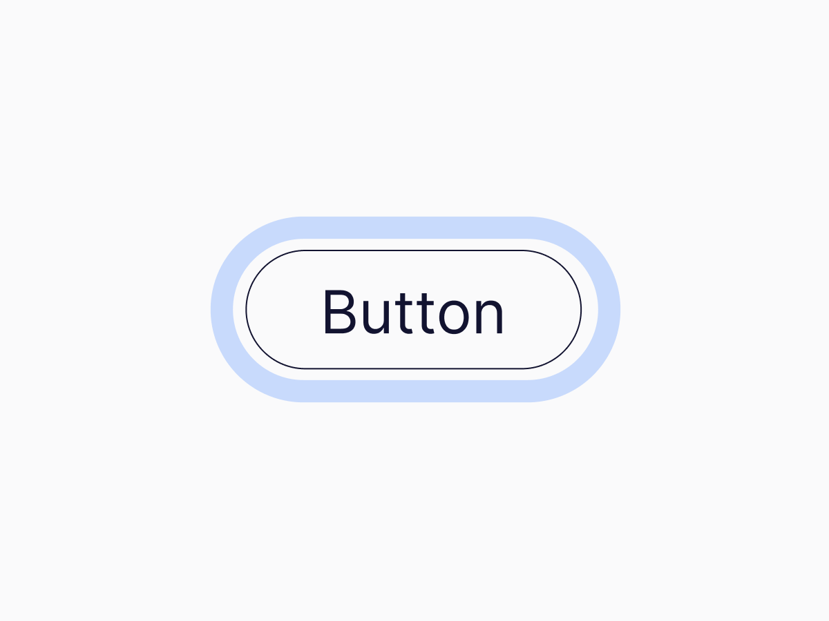
Operability relies on keyboard navigation and prominent focus indicators.
-
Understandability grows from consistent layouts, concise language, and helpful microcopy.
-
Robustness means semantic HTML, responsive design, and assistive tech compatibility.
-
Subtle animated icons (e.g., from Lordicon) reinforce meaning without adding cognitive load.
-
Common mistakes - poor contrast, hover-only actions, and motion that ignores sensitivity - undermine accessibility.
-
Treat accessibility as a mindset embedded from the start and validate it through real-world testing with diverse users.
Why accessibility matters

Inclusivity = better UX
A well-designed product should not exclude anyone. By designing with accessibility in mind, we ensure that people with visual, auditory, cognitive, and motor impairments can engage with digital experiences as seamlessly as anyone else.
Practical tip: Test your design with different types of users, including those who rely on assistive technologies. Conduct usability tests with screen readers and keyboard navigation.

Legal & ethical considerations
A well-designed product should not exclude anyone. By designing with accessibility in mind, we ensure that people with visual, auditory, cognitive, and motor impairments can engage with digital experiences as seamlessly as anyone else.
Practical tip: Use automated tools like Lighthouse or WAVE to check your website for accessibility issues.

Broader reach = better business
A product that is accessible to a wider audience means more potential users, customers, and engagement. Accessibility isn’t just ethical. It’s also a smart business move.
Practical tip: Ensure your UI scales properly for different devices, especially for users who may increase text size for readability.
The core principles of accessible UX Design
To create truly accessible digital products, designers should focus on these key principles:
Perceivability: Making content clear & understandable
Users must be able to perceive all interface elements, regardless of their abilities. This includes providing alternative text for images so that screen readers and other assistive technologies can convey visual information effectively. It also involves ensuring strong contrast ratios between text and background to maintain readability for users with visual impairments. Additionally, using animated icons in a thoughtful way can visually reinforce meaning and enhance understanding. Animated icons from Lordicon.com can, for example, help users quickly grasp concepts and actions without having to rely solely on written text.
Practical tip: Avoid using color alone to convey meaning. Instead, combine color with labels, icons, or patterns.
Operability: Ensuring smooth navigation
Users should be able to navigate a product easily, regardless of how they interact with technology. This means ensuring full keyboard navigability, so that all actions can be performed without the use of a mouse. It also involves providing clear and intuitive focus indicators for users who rely on screen readers or keyboard input to move through the interface. Moreover, designers should avoid elements that require precise movements, such as very small buttons or interactions that depend on hovering, as these can create barriers for users with motor impairments or those using alternative input devices.
Practical tip: Test your website using only a keyboard. Can you navigate it without using a mouse? If not, adjustments are needed.
Understandability: Simplifying interactions
Interfaces should be predictable and easy to use. To achieve this, designers should maintain consistent layouts and design patterns throughout the experience, helping users build familiarity and confidence. The use of simple, concise language ensures that information is clear and quickly understood. Visual cues, such as animated icons, can further guide users through workflows, offering additional clarity without overwhelming them with too much text. Animated icons, in particular, help communicate intent and action in a way that feels intuitive and supportive.
Practical tip: Write clear and action-oriented microcopy. Instead of “Submit,” use “Send message” or “Complete order” for better clarity.
Robustness: Ensuring compatibility across devices
Users access digital products through a wide range of devices and assistive technologies, so a robust design must account for this diversity. It should be fully compatible with screen readers, voice commands, and other assistive tools to ensure inclusivity. The interface should also be responsive, adapting seamlessly to different screen sizes and input methods without losing functionality or clarity. Additionally, animations should be carefully optimized to enhance the experience, supporting user interactions without causing distraction or discomfort.
Practical tip: Use semantic HTML elements (e.g., button instead of div for buttons) to improve compatibility with assistive technologies.
How animated icons enhance accessibility
Visual feedback is crucial for accessibility. Use subtle animations to guide users rather than distract them. Motion should enhance, not overwhelm, the user experience.
Well-designed animated icons can provide:
-

Clearer affordances (e.g. a shaking lock icon indicating incorrect login credentials).
-

Reinforced meaning for those with cognitive impairments or language barriers.
-

Improved user engagement through subtle, helpful animations.
Lordicon’s library of customizable animated icons makes it easy to enhance accessibility without adding unnecessary complexity. Whether guiding users through onboarding or providing visual confirmation of an action, these icons make digital experiences smoother for everyone.
Common accessibility mistakes
Poor contrast and illegible text

Mistake: Light gray text on a white background.
Fix: Ensure the text has a contrast ratio of at least 4.5:1 for normal text and 3:1 for large text to improve readability.
Practical tip: Use online contrast checkers to verify that text is easy to read for all users.
Lack of keyboard navigation support
Mistake: Interactive elements that can’t be accessed via keyboard.
Fix: Ensure all functionality is available without a mouse.
Practical tip: Provide clear focus indicators so users always know where they are on the page.
Lack of keyboard navigation support
Mistake: Hidden labels and tooltips that appear only on hover.
Fix: Provide persistent, clearly labeled actions.
Practical tip: Use animations and transitions to reveal information progressively, without requiring hover actions.
Ignoring motion sensitivity
Mistake: Excessive motion effects that can cause dizziness or discomfort.
Fix: Offer a "Reduce motion" setting for users who prefer minimal animations.
Practical tip: Avoid flashing animations that could trigger seizures or discomfort for sensitive users.
Final thoughts: Accessibility as a mindset, not a checklist
Accessibility is not a box to tick. It’s a commitment to human-centered design. When we approach UX with empathy, we go beyond regulations and start building products that truly respect the diverse ways people interact with technology. It’s about anticipating needs, removing barriers, and designing with care. By embedding accessibility into the creative process from day one, we not only meet standards. We create experiences that are fair, intuitive, and inclusive by default. And that, ultimately, is what great design is all about.
Checklist
-
Provide descriptive alt text for all meaningful images to ensure they are accessible to screen readers.
-
Maintain sufficient color contrast (at least 4.5:1 for normal text) to enhance readability for all users.
-
Avoid using color alone to convey information - use labels, icons, or patterns for better clarity.
-
Ensure full keyboard navigation by testing if all interactive elements are accessible without a mouse.
-
Use clear focus indicators so users can see where they are when navigating via keyboard.
-
Write simple and action-oriented microcopy to help users understand what actions they are taking.
-
Design consistent and predictable layouts to support cognitive ease and usability.
-
Use semantic HTML elements like button or nav to improve assistive tech compatibility.
-
Test for motion sensitivity by offering a “Reduce motion” option and avoiding flashing animations.
-
Use animated icons meaningfully to reinforce actions and guide users without overwhelming them.
-
Conduct real-world usability testing with diverse users, including those with disabilities.
Sources
Sources
- W3C. Web Content Accessibility Guidelines (WCAG) 2.1
- W3C. Understanding WCAG: Contrast (minimum)
- W3C WAI. Accessibility principles
- W3C. Keyboard accessibility (perspective video)
- Nielsen Norman Group. Keyboard accessibility
- WebAIM. Keyboard accessibility
- WebAIM. Contrast checker
- Google Developers. Lighthouse accessibility audits
- Deque University. Accessibility best practices
- MDN Web Docs. Using semantic HTML
- Wikipedia. WAI-ARIA
- UX Collective. The sorry state of keyboard navigation
- UXPin. WCAG 2.1.1 Keyboard accessibility
- Lordicon. Animated icons
- Lordicon. Understanding icon animation
- Creattie. Animated icons: Everything you should know
- Material design. Animated icons
- BOIA. WCAG 2.1 Principles explained: operability
- AudioEye. WCAG: Four principles for digital accessibility
- A list apart. Designing for accessibility
- Smashing Magazine. Inclusive components
- ADA.gov. Americans with Disabilities Act (ADA)
Tags
accessibility
ux design
inclusive ux
animated icons
visual design
keyboard navigation
title
perceivability
usability
cognitive accessibility
screen readers
responsive ui
motion design
web accessibility
ethical design
Was this article helpful?


Sorry to hear that. How can we improve this article?