
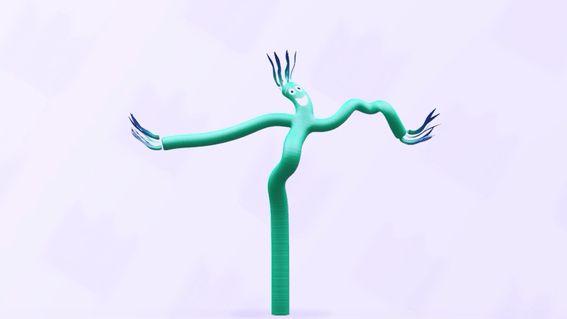
If an animation looks or feels out of place, the user’s immediate reaction is confusion, not curiosity. Even subtle unnatural motion can quickly lead to an emotional disconnect. When something moves in a way that breaks the laws of physics or behaves in an unfamiliar, exaggerated, or overly bouncy manner, it feels off, and users notice it. Whether they can articulate the issue or not, the result is the same: hesitation, frustration, or worse, mistrust in the product.
Familiarity is the key to keeping your user on board with your message. We expect things to move the way they do in the physical world: with weight, momentum, acceleration, and a clear beginning and end.
When that expectation is broken, when a dropdown “floats” for too long, or an icon “jumps” without cause, it creates a moment of friction, where the user’s brain has to pause, recalibrate, and wonder why something doesn’t behave the way it should.


Sorry to hear that. How can we improve this article?